I was actually going to use a different subject originally but when I saw the Lightfury sitting on a desk I thought I’d have a change and go for that instead to see what I could come up with. The starting point for me was to have a sky blue background, partly because I have an A3 card in sky blue already but also because I thought a sky colour would suit a dragon. That and I don’t have a big pile of gold to use.
I taped down the corners of the card to stop it moving and to flatten it out a bit and set up my main light with a softbox towards the back.
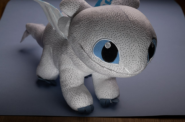
This made for a nice, soft image but only the very top is lit so I tried a few more positions, ending with it being just off to the side. I also tried adding a small sheet of foam board to the left to account for the darkness by reflecting the light but it brightened the dots too far so that they couldn’t be seen.
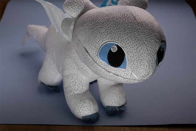
I tried a few different angles with the card just by holding it in my hand and moving it around to see where it looked best. However, as you can see in the image below, this had the same problem but the light was a bit more focused (just above the eye on the left). Holding it further just made the patch a little smaller. I also trimmed off the loose thread on the right paw as that was a distracting element.
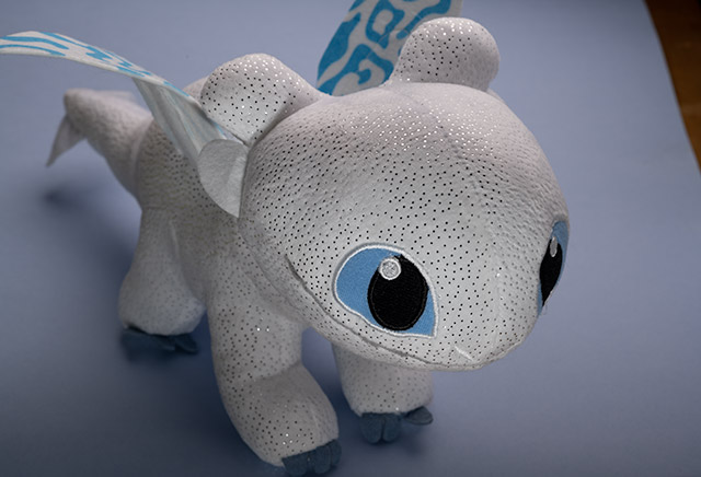
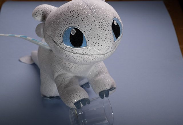
I did use the card in the end but just moved it a little further away on the left side, rather than angling from the front. The composition didn’t feel right to me though; the general aspect of looking to the side (and ensuring that the card fills the background) seemed fine but it felt like it was lacking something. Elevation. After trying a couple of different props I settled on a glass under its paws to prop it up. That was much better in my opinion and almost felt like it had a bit more of a cheeky smile.

I brought down its right wing as well so that it’s not looking at the underside, which looks a lot less like a wing and loses the pattern from the top altogether.
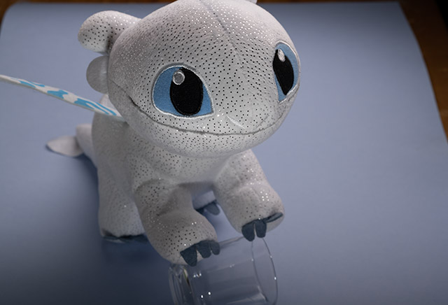
Lastly, I added a speedlight to brighten up the areas underneath so that there wasn’t so much shade.
In post, there were a few small tweaks. Bringing down the texture and increasing the clarity brought a bit more softness. The above images are completely unaltered from RAW, only decreasing the size and quality to save on space (these are 45MB RAWs, down to 46KB jpegs).
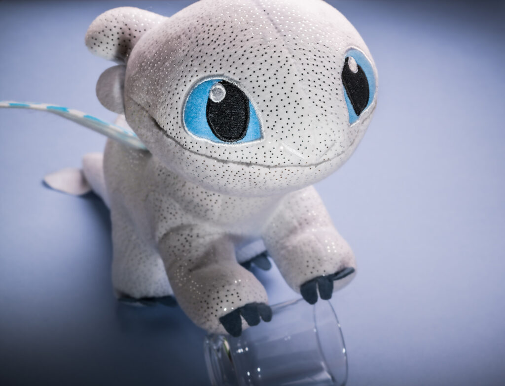
I was also going to remove the glass but I like how it seems to be propping itself up so I left it in. I also tried moving the claw on the right but that didn’t seem to cooperate so I left it alone. Using a transparent object allows the light to pass through, though as I ultimately decided to leave it in something else could have been popped there instead. Ideally I would’ve ensured that the head wasn’t cut off in the photo but the background was a bit tight. The wing also decided to straighten out – an earlier test shot showed off the pattern more though this wasn’t a big deal.
I enjoyed the experiment though and I really like the end result.