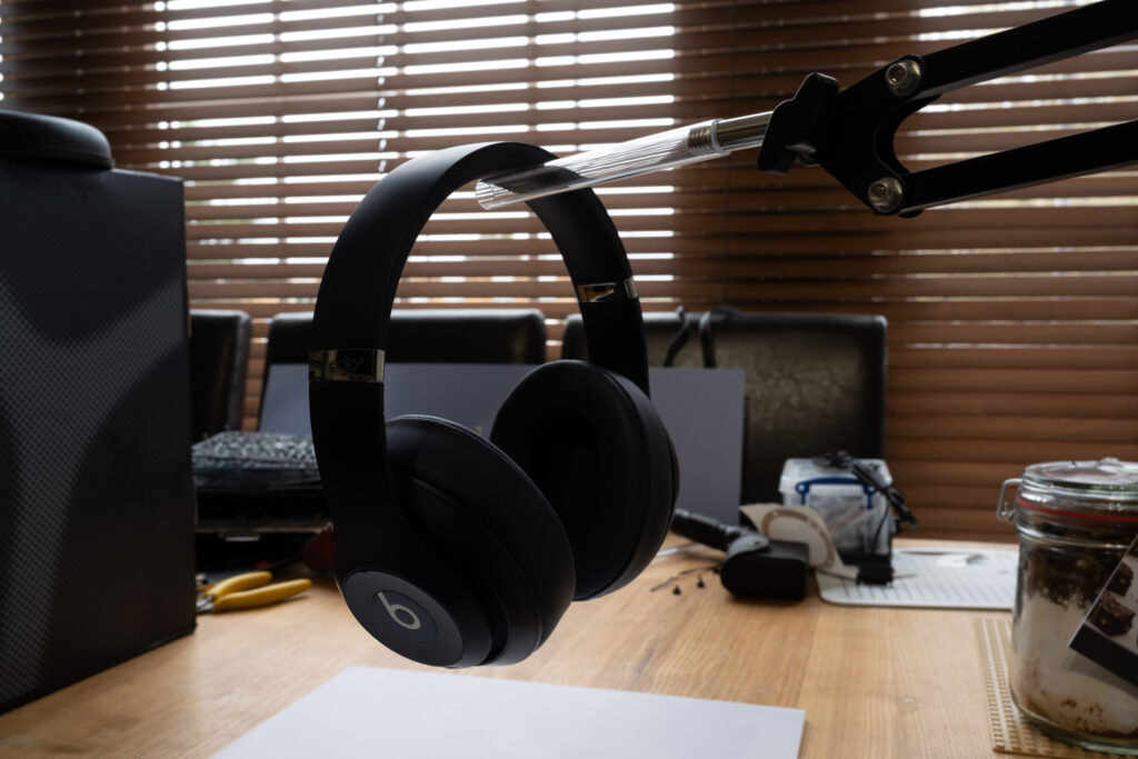
Recently I was trying out a different approach to photographing headphones. The gist was that the headphones should be floating in the air and have some interesting lighting to highlight them. On this occasion I decided to document the thought process as I was going along.
First of all the headphones need to be suspended in the air. Using “invisible” wire is possible, though the headphones would be likely to sway. Even a slight amount of movement means that subsequent shots could be completely out of alignment for any post-processing.
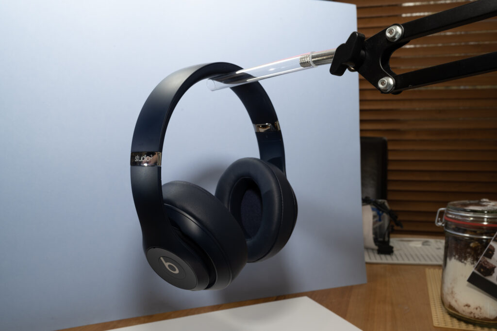
In the shot below I’ve started off with an overhead light using a lamp and a foam board underneath to provide light bounce-back and a nice contrast for the headphones. I’ll deal with the background after.
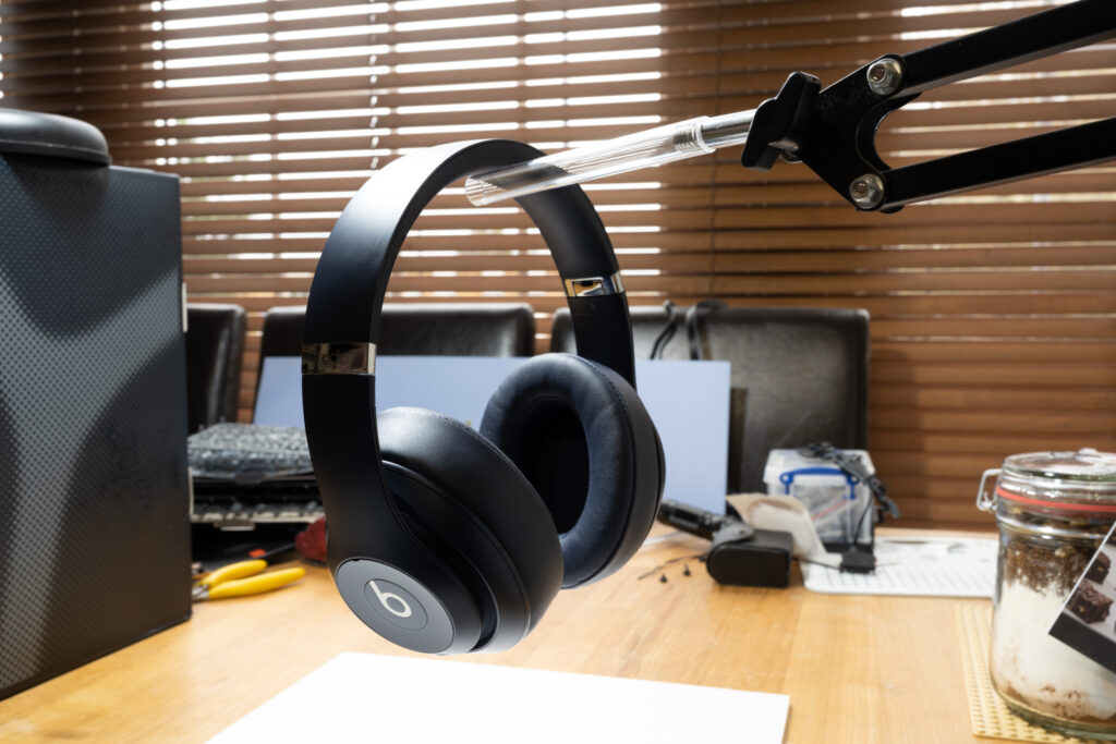
The headphones are a bit dark so the light needed to be brought in next.
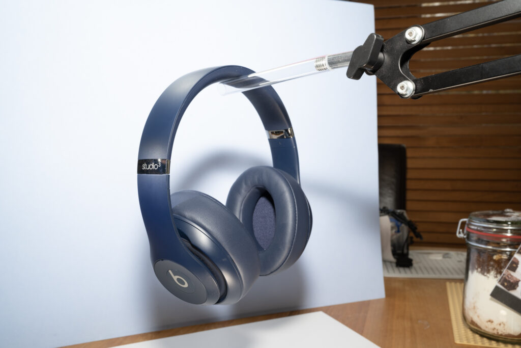
They’re well-lit at the top but the light is a bit harsh. I don’t own a diffuser so I substituted some makeshift diffusion material using paper used for a wet palette. The darker areas will be addressed later – one step at a time.
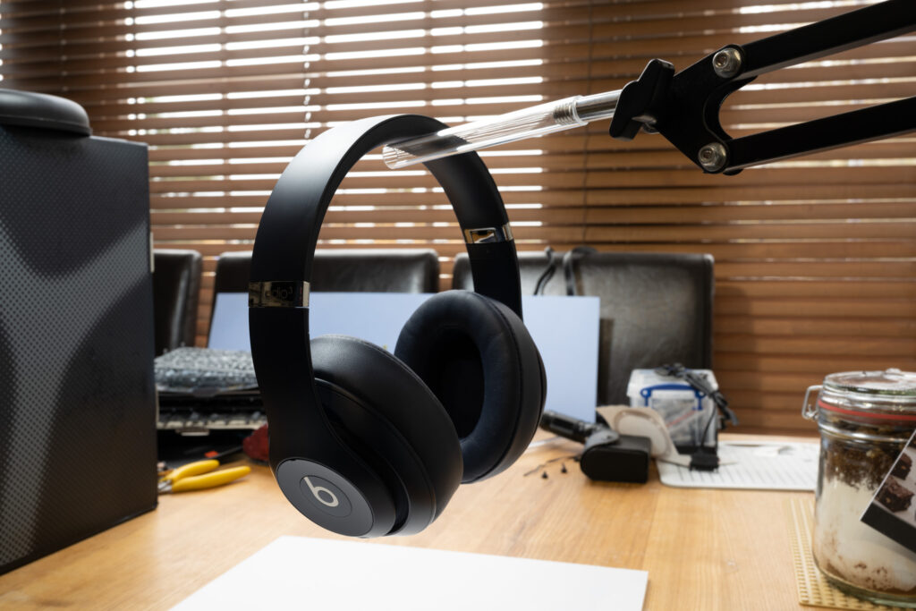
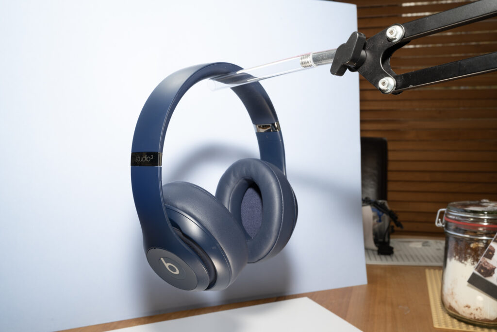
If you look at the band now there’s a much softer gradation of light, which is so much nicer than without it! It’s over-exposed at the moment but that’s an easy fix. Now I can look at addressing the background.
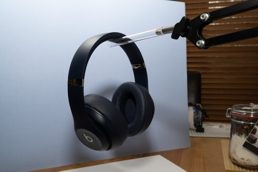
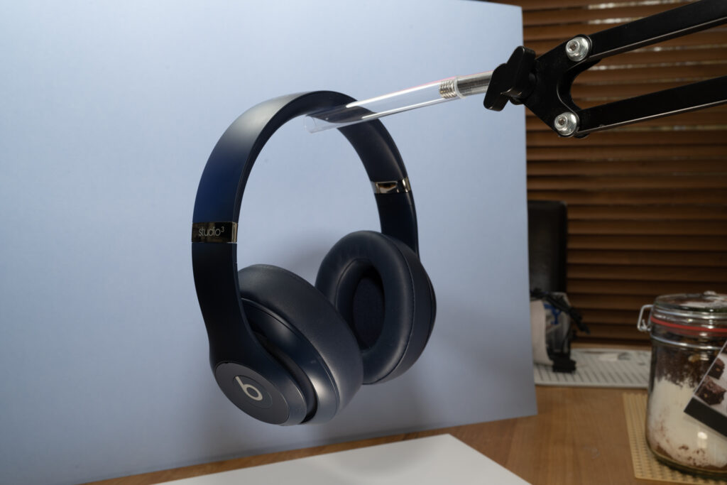
The blue makes for a nice contrast here in my opinion, though there are more shadows to work with now so I’ll add more light.
Above I’ve opted to concentrate on the areas that needed to be brought out more. Most notably this is the logo on the side, which denotes the model of the headphones. This was just using a torch. It’s a bit dark overall still though so I add the flash.
If I didn’t have the torch shining on the logo I feel it loses something in the overall image, as below.
I then darkened the whole image down as I felt it was too bright still overall.
The surrounding light is a little high on the photo that used the torch so I can merge the two together for a more balanced look.
At this point I stopped as the composition wasn’t working out for me. The concept is fine but the background wasn’t covering the image sufficiently and the bottom wasn’t covering the table enough. I will revisit this in the future, though on this occasion I ran out of time (and space) to apply to this setup to get it closer to the way I wanted it.